Born within the Health workgroup of Interaction Design Foundation Madrid, DoctorD+ is the MVP of a medical management app designed to simplify the interactions of users with the public health system of the Community of Madrid.
The Problem
Forgotten appointments, reminders never arrived, lost medical reports, impossibility to get in touch with the local medical center, multiple apps for each administrative procedure and health insurance company — even before starting to work on this project, we already knew that we, as well as nearly everyone we know, suffered from one or more of these problems on a regular basis when dealing with the Spanish public health system.
The Design Process
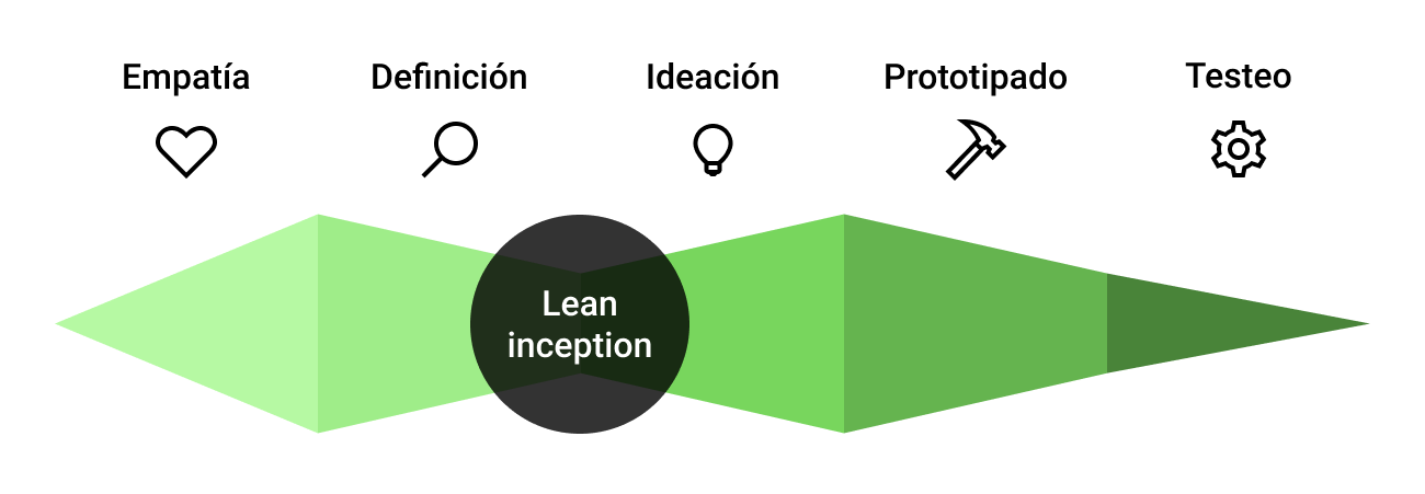
We chose to address this problem using the Design Thinking framework harmonized with Paulo Caroli's Lean Inception, a methodology that effectively combines Design Thinking and Lean Startup to incrementally deliver a Minimum Viable Product (MVP). These two methodologies helped us redesign the Community of Madrid's public health system digital touchpoints.
My Role
I was involved through all the stages of the process with a particular focus on the Prototyping and Testing phases, which I headed.
Timeline
March 2021 — January 2022
Empathy
The Empathy stage helped us understand and discover the needs of the people who use this type of service, and the results served as leverage for the next phase of Ideation.
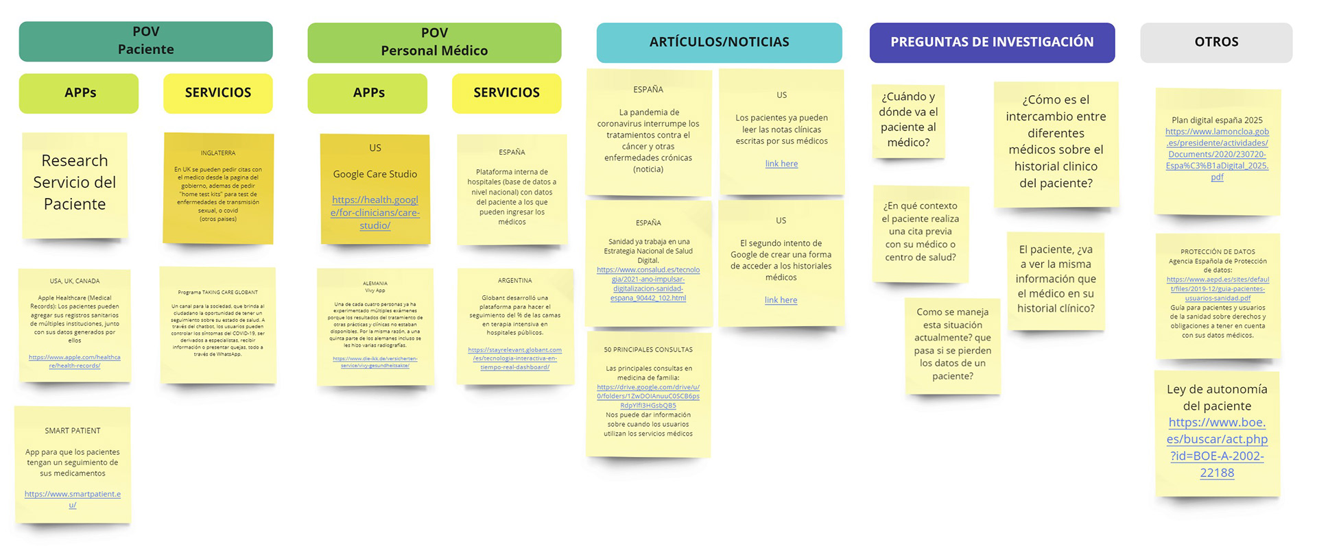
1. Secondary Research
We researched news, reports, and studies to better understand the context of our design challenge. Our desk research found that in Spain there are 18 different regional solutions for consulting and managing the same medical data, whether you are a patient or a healthcare worker.
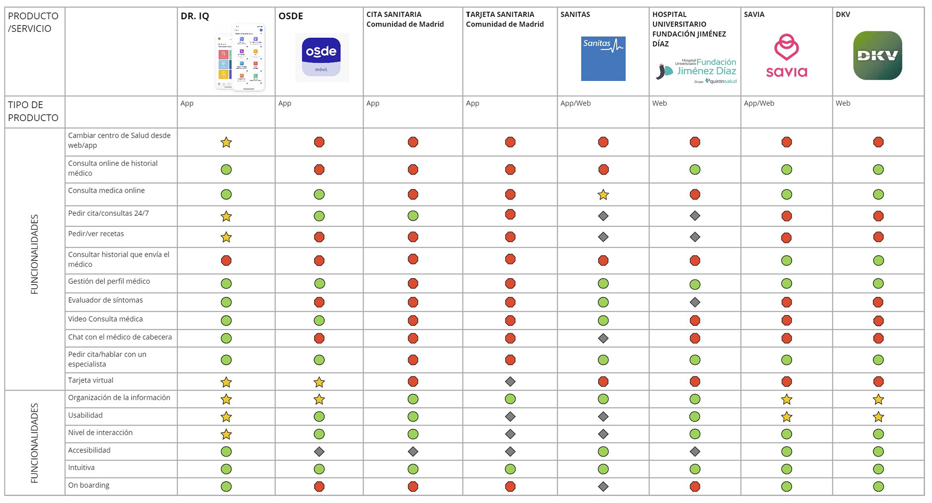
2. Competitive UX benchmarking
We mapped similar services that try to solve similar problems to see how they do it. Here we were able to detect complicated navigation patterns for any kind of technological agility that were common to different regional services.
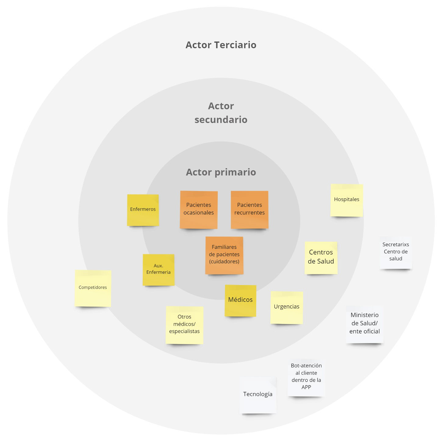
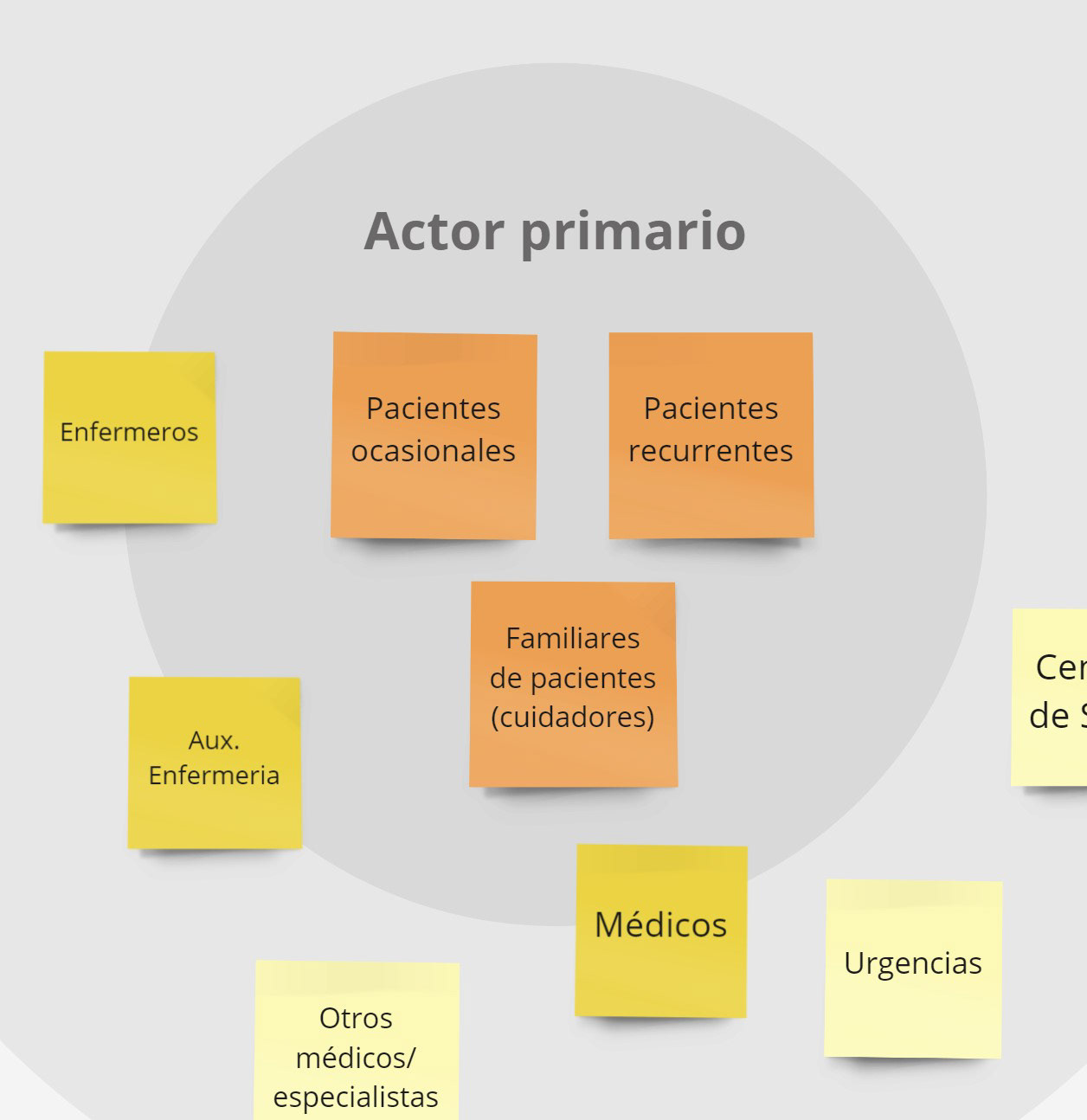
3. Stakeholder mapping
With this tool, we recognized and defined the three levels of stakeholders in our project.
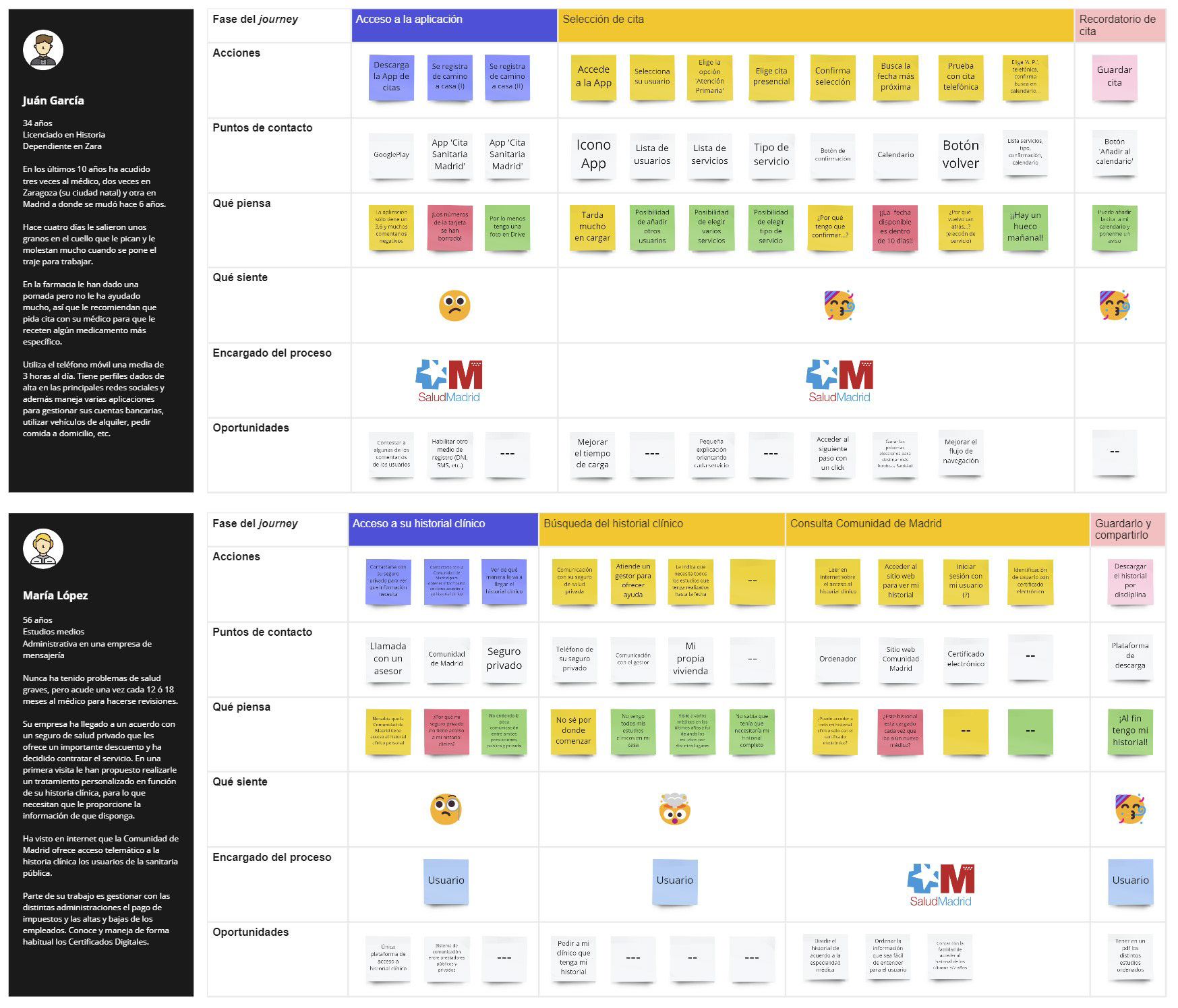
4. Customer journey - As is
We mapped the journeys of our primary users to understand what their current experience was like. This helped us detect that the biggest problems could be concentrated in the onboarding of the digital service, the selection of appointments, and the access to the clinical history.
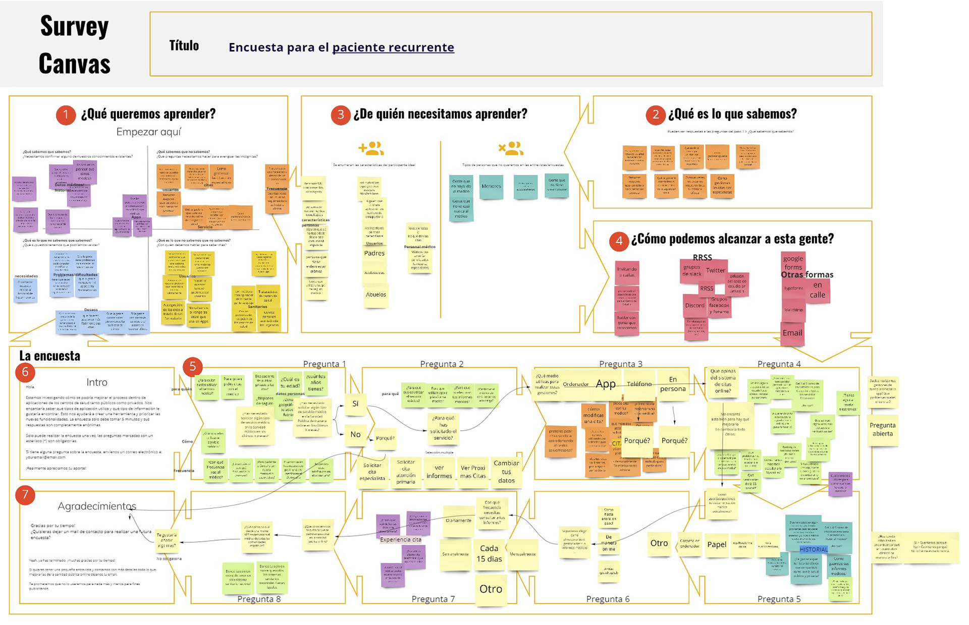
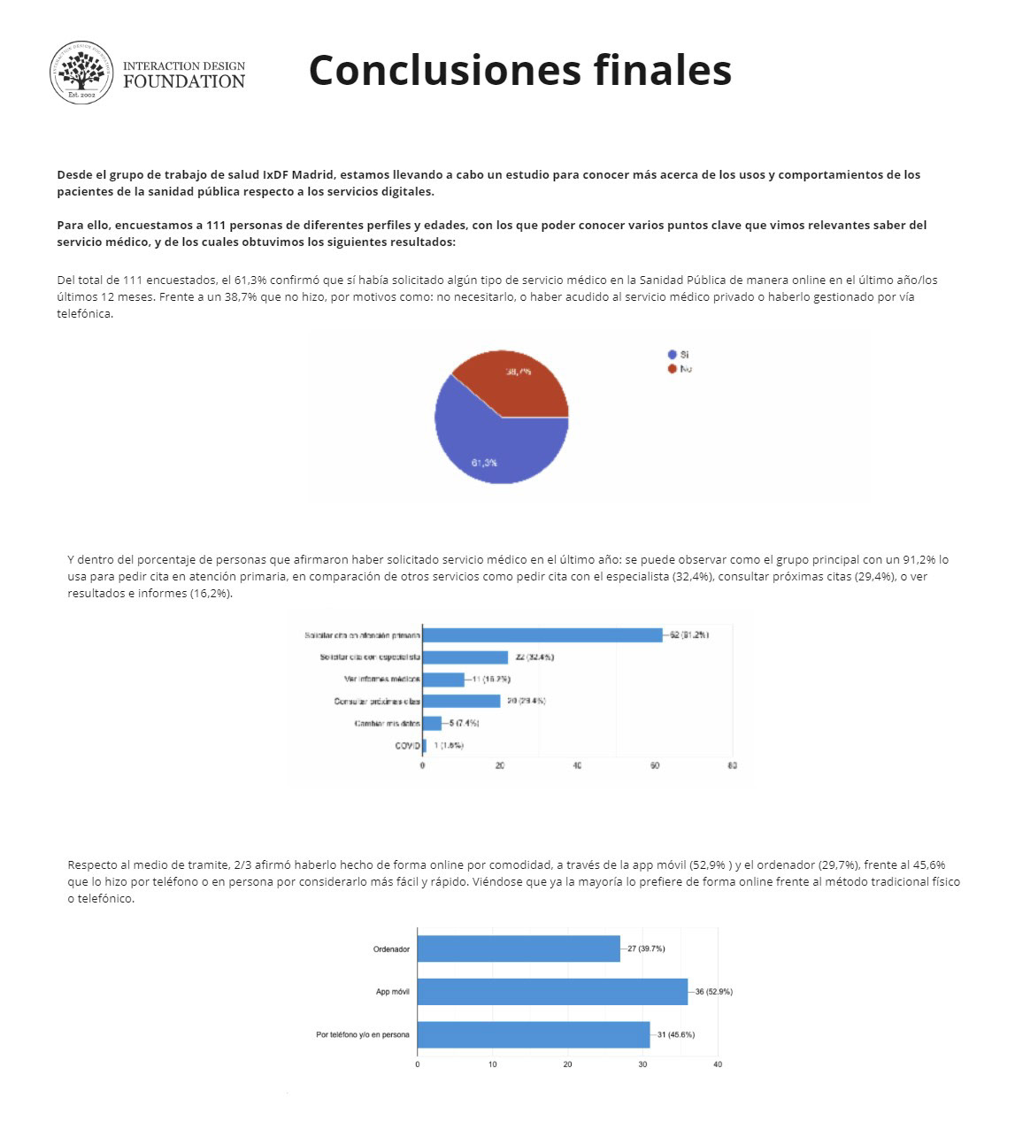
5. UX research survey
To understand more deeply the needs of the primary user we designed a survey.
This canvas allowed us to design the script with the most important questions to be asked. We grouped the answers to detect patterns and generate general conclusions that will serve as a lever for the preparation of the in-depth interviews.
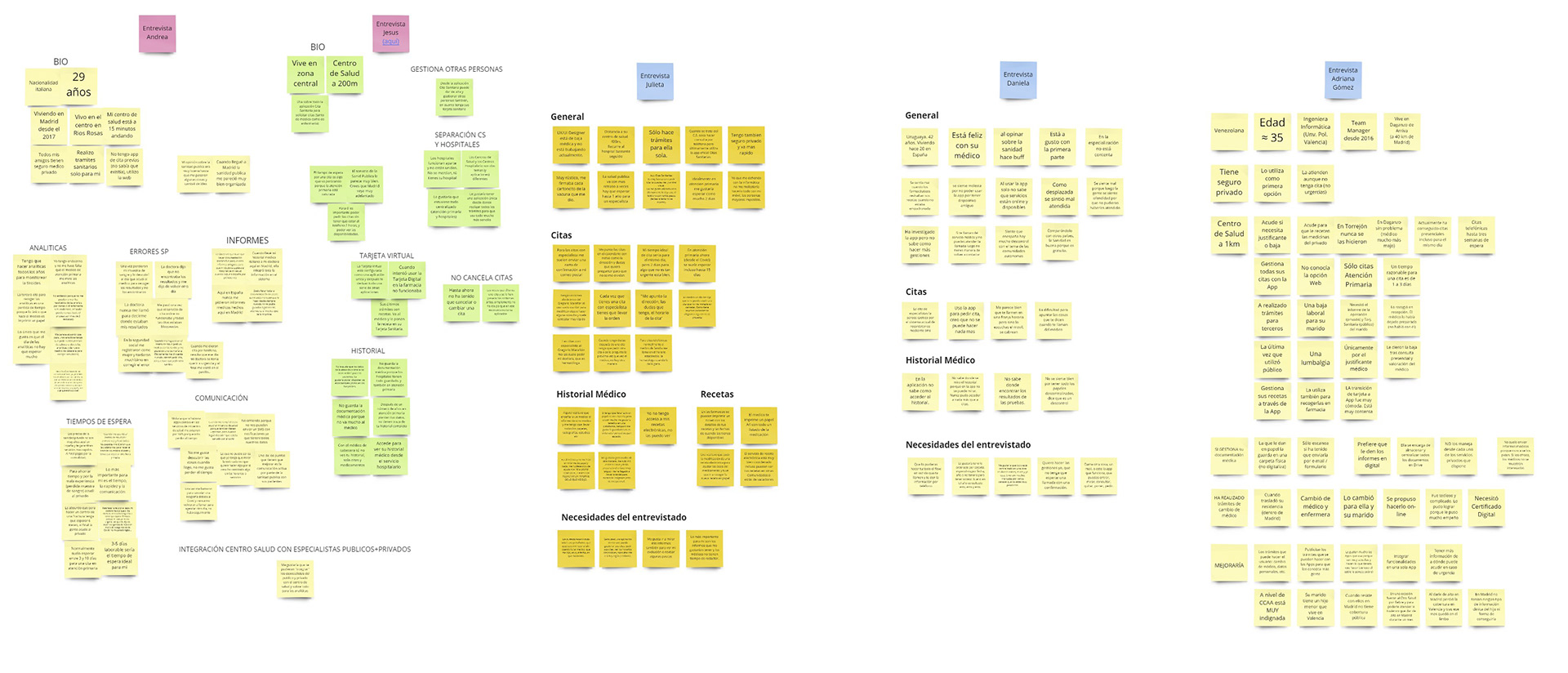
6. User Interviews
With the results obtained from the survey and the profiling of the users required for the in-depth interviews, we prepared the script for the user interviews.
Once the interviews were completed, we once again grouped the results to identify common patterns to work on in the next processes of Definition and Ideation.
Definition & Ideation
In the Definition and Ideation phases, we used the Lean Inception methodology to understand the key features of the product and build a canvas that helped formulate the characteristics of an MVP.
1. Product Vision
Our product was a mobile app targeted to all public healthcare users who want to manage their doctor appointments, medical history, and medical documentation digitally for themselves and their dependents.

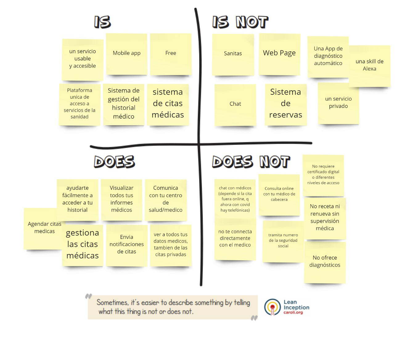
2. The Product IS / IS NOT — DOES / DOES NOT DO
3. Product Goals
4. User Personas
The interviews allowed us to identify our user personas and their journeys. We defined three personas:
― the patient who goes to primary care occasionally or for medical check-ups such as blood tests;
― the patient who may have chronic health problems and who visits a specialist a lot;
― the patient who needs to make arrangements for children or other dependents.
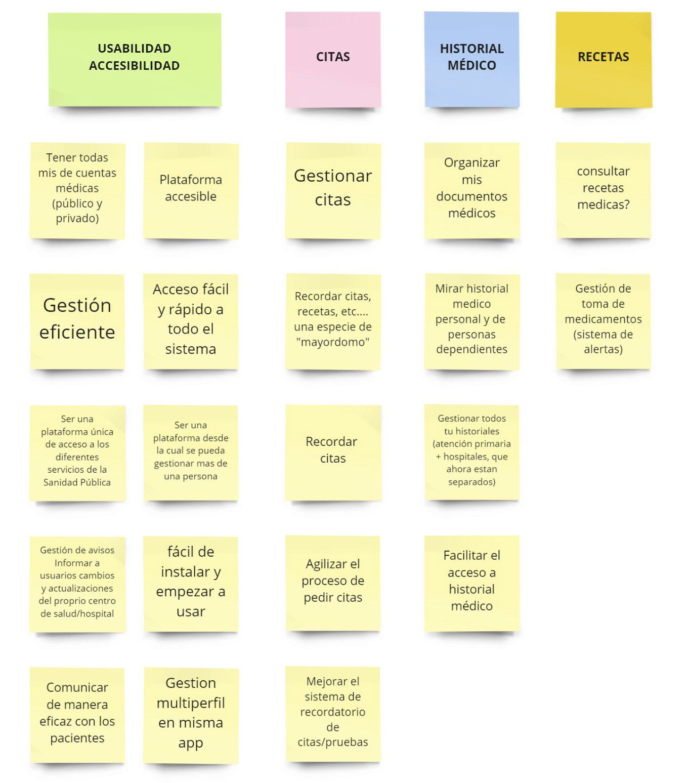
This exercise allowed us to empathize even more with our users and define the three fundamental pillars of our app: health appointments, medical history, and reports.
5. User Journeys
For all our UX personas, we created a specific scenario and mapped their journeys. These journeys aim to describe the steps that each user persona follows and the pain points they face in order to reach the final goal.
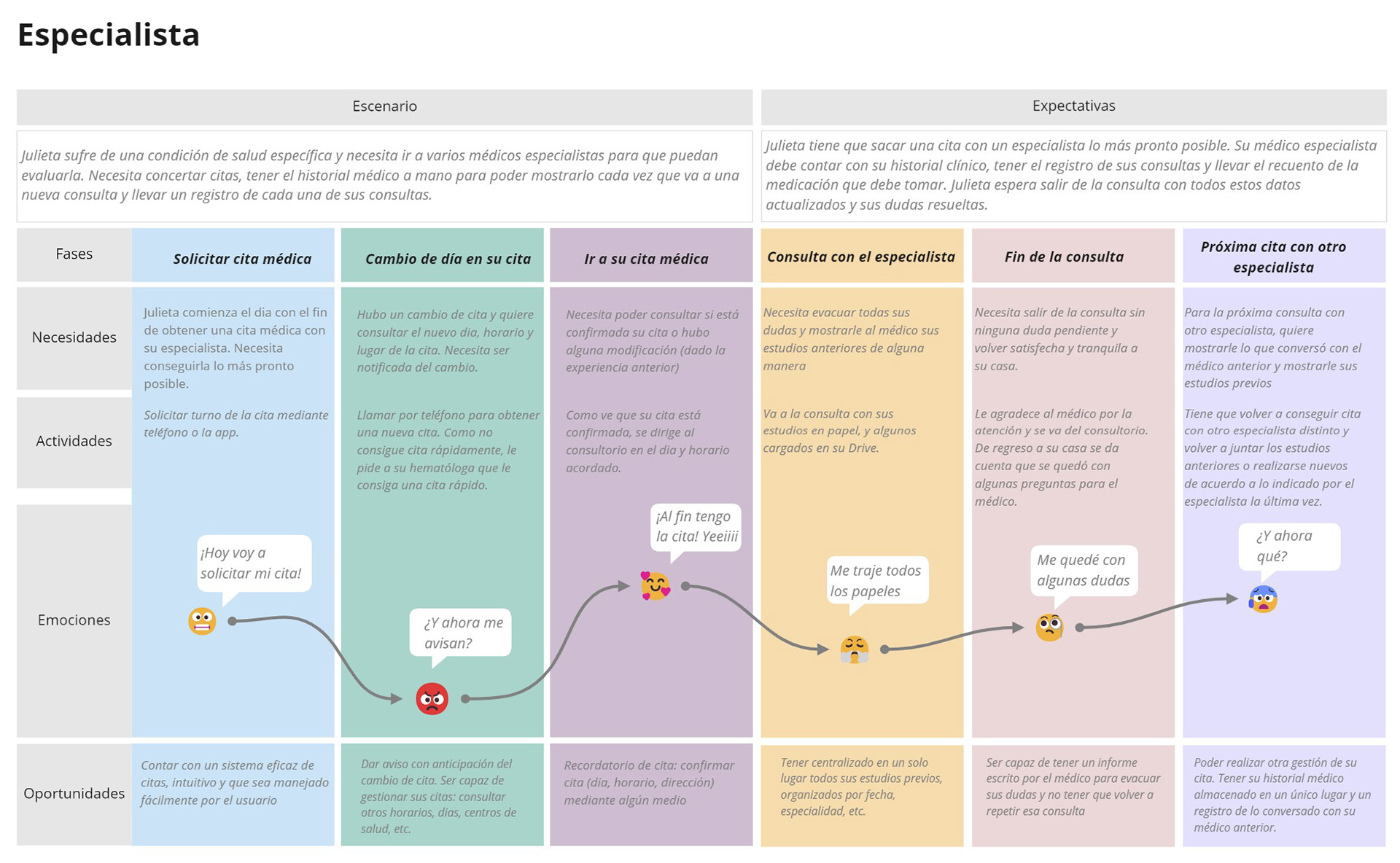
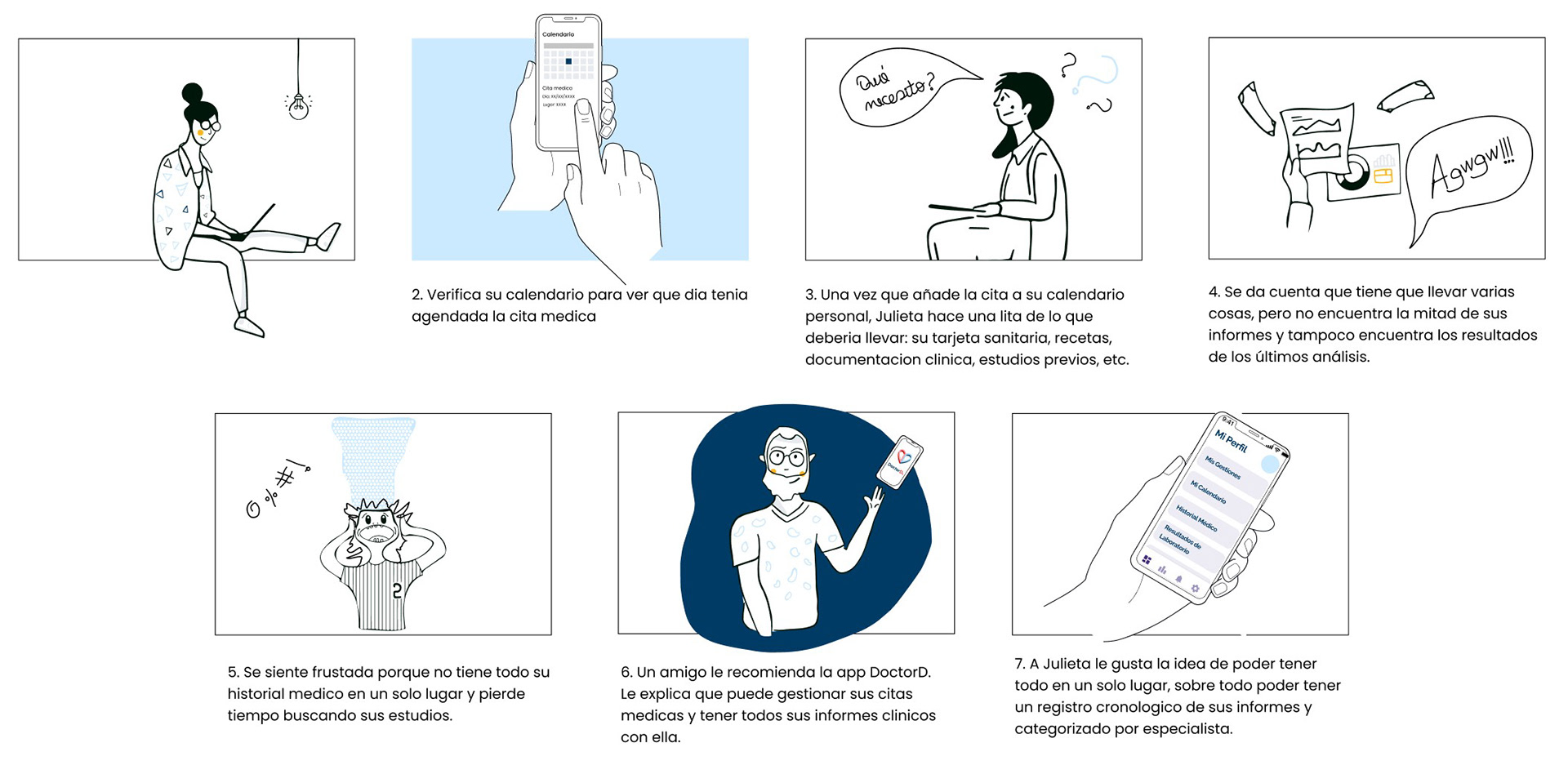
Julieta suffers from a specific health condition for which she needs to see several specialists. She has to make an appointment with one of the doctors. Her specialist should have her medical history, a record of her consultations, and a record of the medication she needs to take. Julieta hopes to leave the consultation with all this information updated and her doubts resolved.
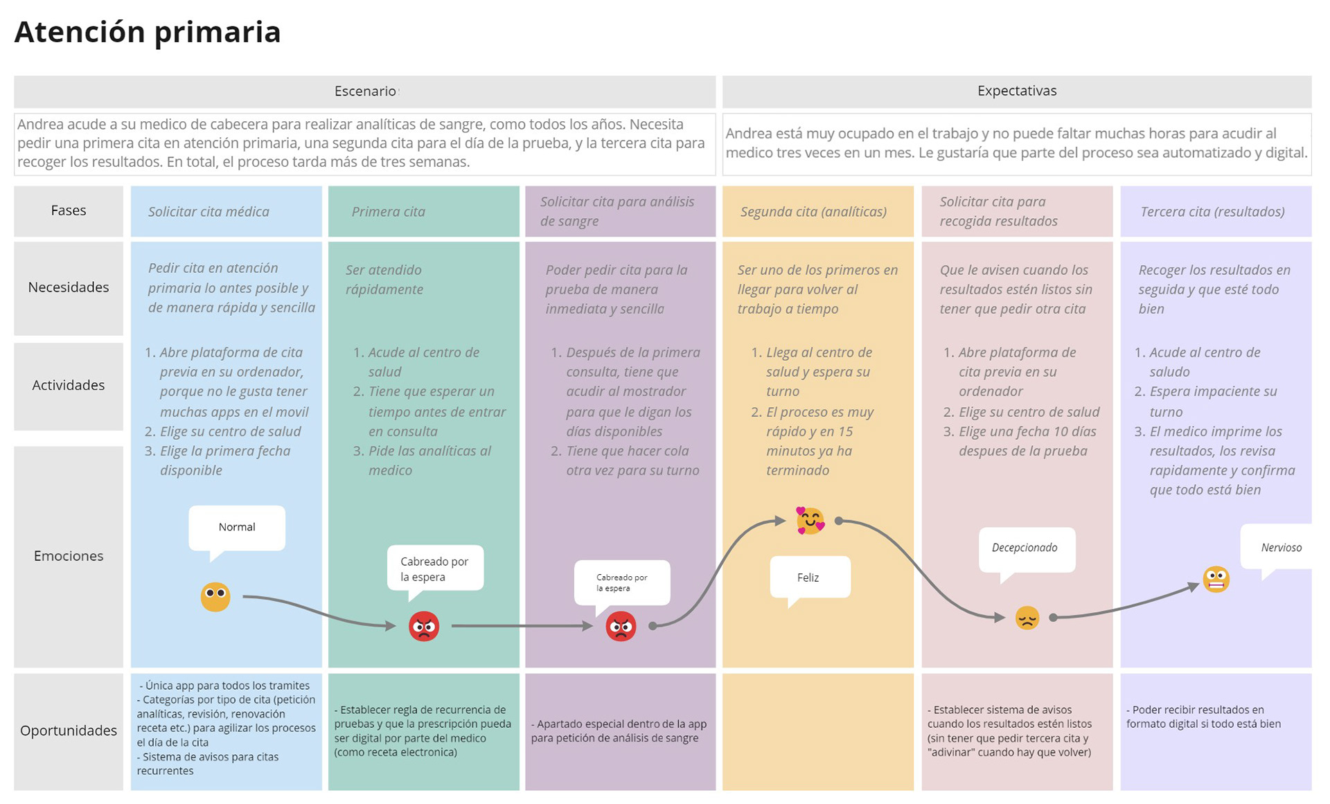
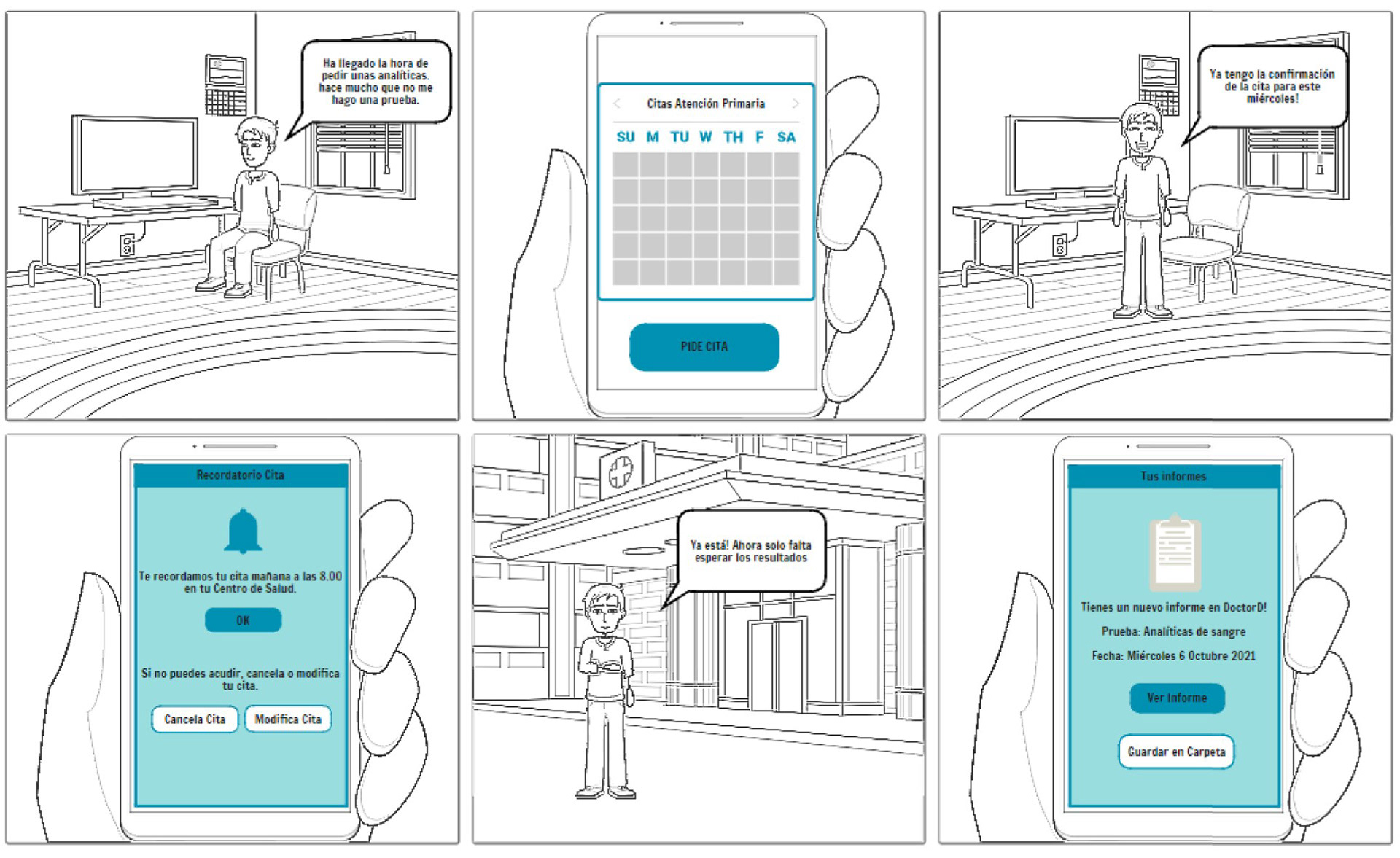
Every year, Andrea undergoes a regular blood test. To do that, she needs to book three appointments: one with the general practitioner, a second one for the actual blood test, and a third one to pick up the results. The process is long and generally takes more than three weeks. Andrea is very busy at work and can't afford to miss too many hours. She would like part of the process to be automated and digital.
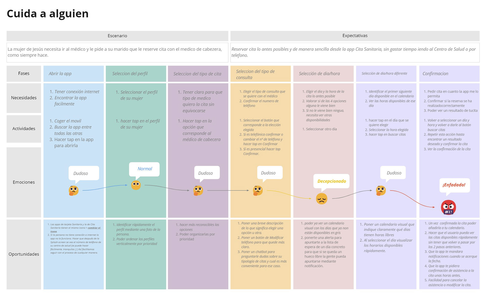
Jesus' wife needs to go to the doctor and she asks her husband to book an appointment for her with the general practitioner, as he always does. Jesus needs to book the appointment as soon as possible and easily from the Cita Sanitaria app, without spending time going to the Health Center or reaching them by phone.
6. Feature Brainstorming + Technical, Business, and UX Review
As a team, we brainstormed all the features that our app had to have, and we put into practice the Lean Inception evaluation process.
We evaluated each of the features in terms of Effort (⚙️, how much work we would have to do to create it), Business Value (💲, the value it would bring to our business), and finally User Experience (❤️, how much users would love the feature). We then assigned a color to each one by combining the level of technical and business certainty.
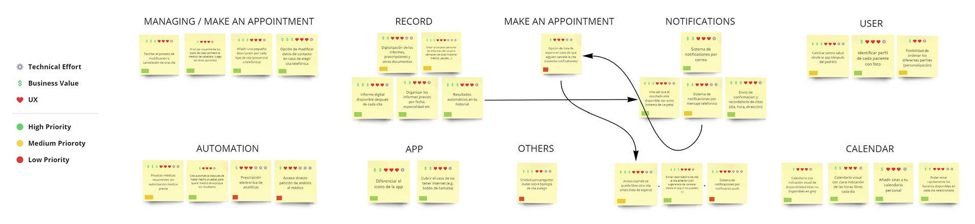
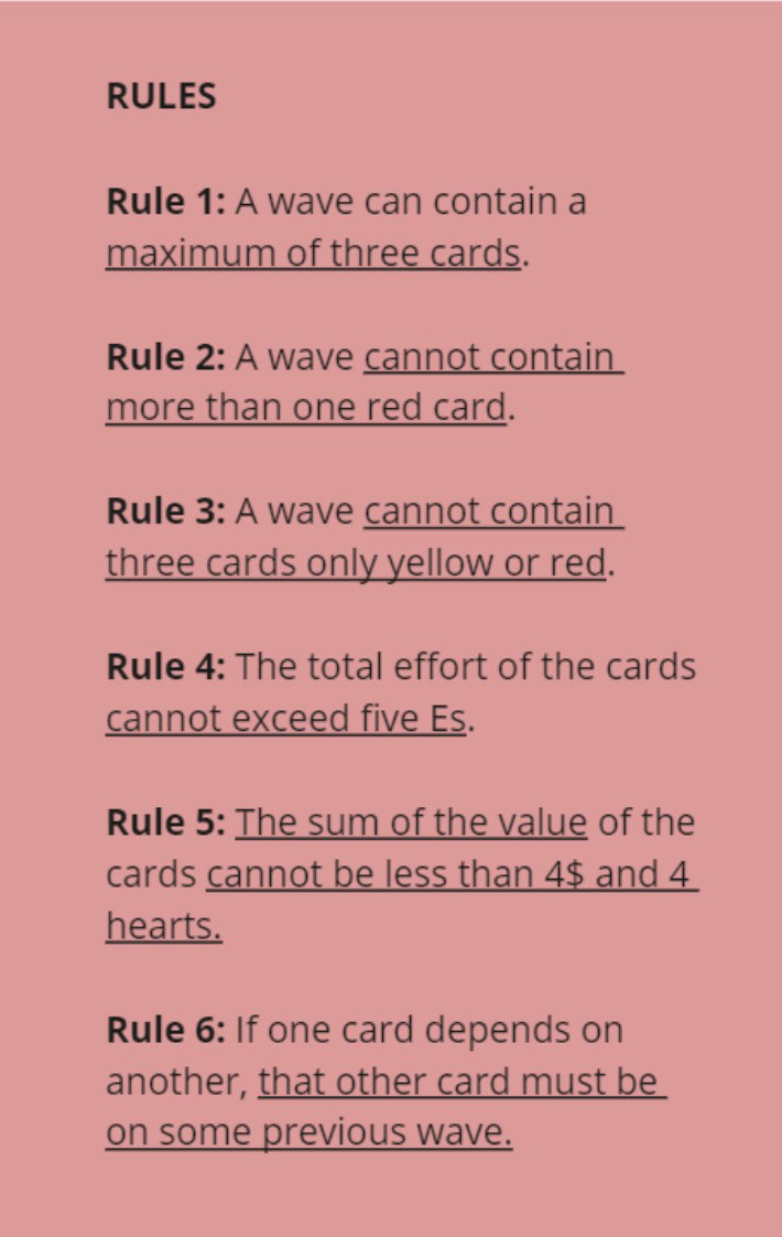
7. Feature Sequencer
The Feature Sequencer helped us organize and view the features across the incremental validation of the product.
Thanks to this exercise we could identify those functionalities that, as much as we wanted to include in our app, unfortunately, were not a priority, did not have enough impact, or required too much effort (e.g. adding a chatbot to solve doubts or the possibility to sign up to a waiting list to get an appointment).
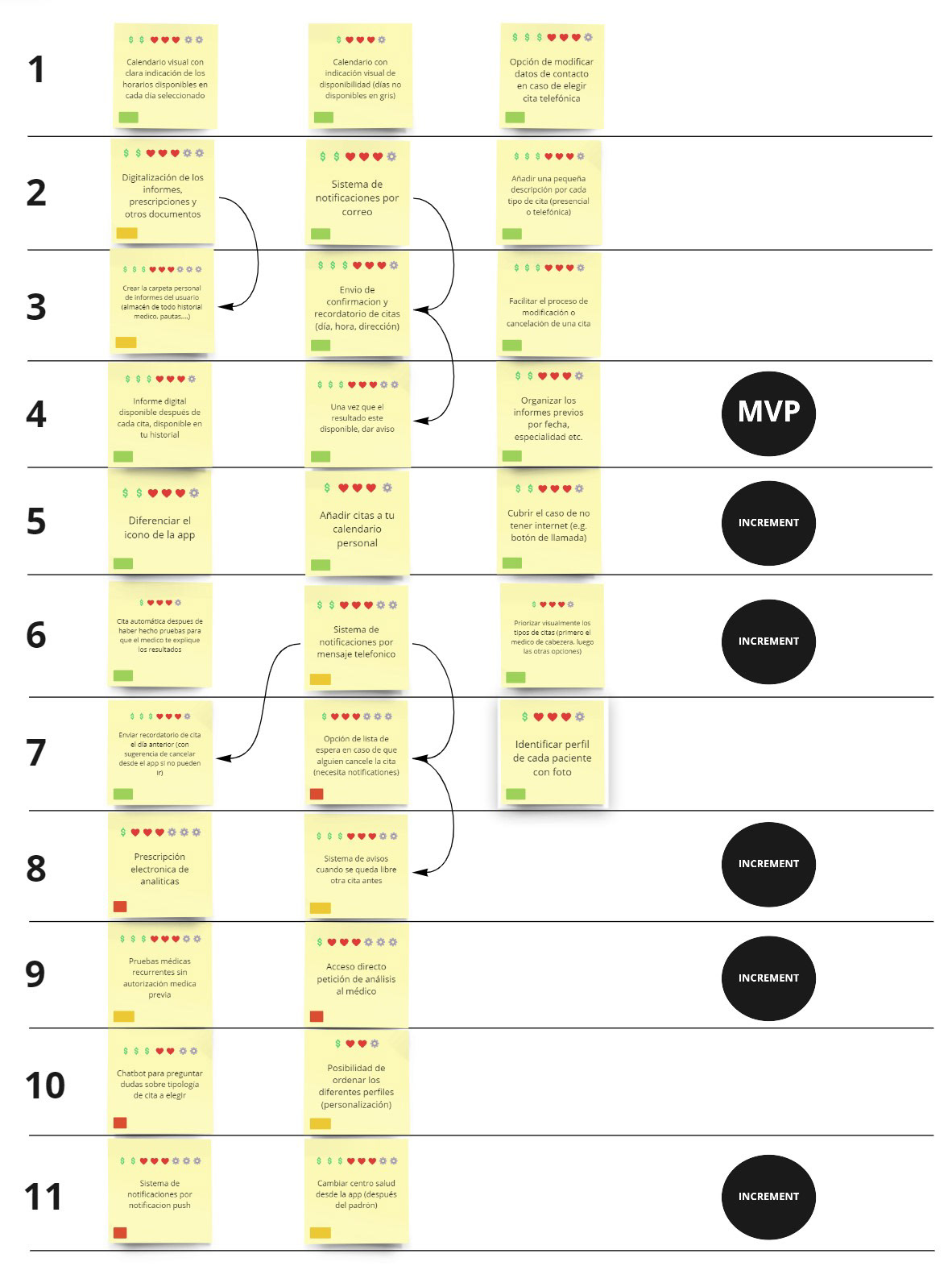
8. MVP Canvas
The MVP Canvas helped us align and define the MVP, the simplest version of the product that could be made available to the business (minimum product) and that could be effectively used and validated by the end-users (viable product).
With our app we aim, for example, to reduce telephone appointments, access clinical results without having to make any appointments, reduce waiting lists, and improve the productivity of the public health staff.

Prototyping
In the Definition and Ideation phases, we have used the Lean Inception methodology to understand the key features of the product and build a canvas that helps formulate the characteristics of an MVP.
1. Story Boards
Creating different storyboards helped us see into the user's situation and imagine the flows we would be working on later:
― Request an appointment for yourself;
― Request an appointment for another person;
― Reminder and management of tests (blood tests, MRI scans, X-ray scans...).

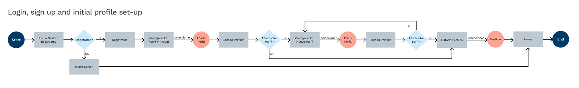
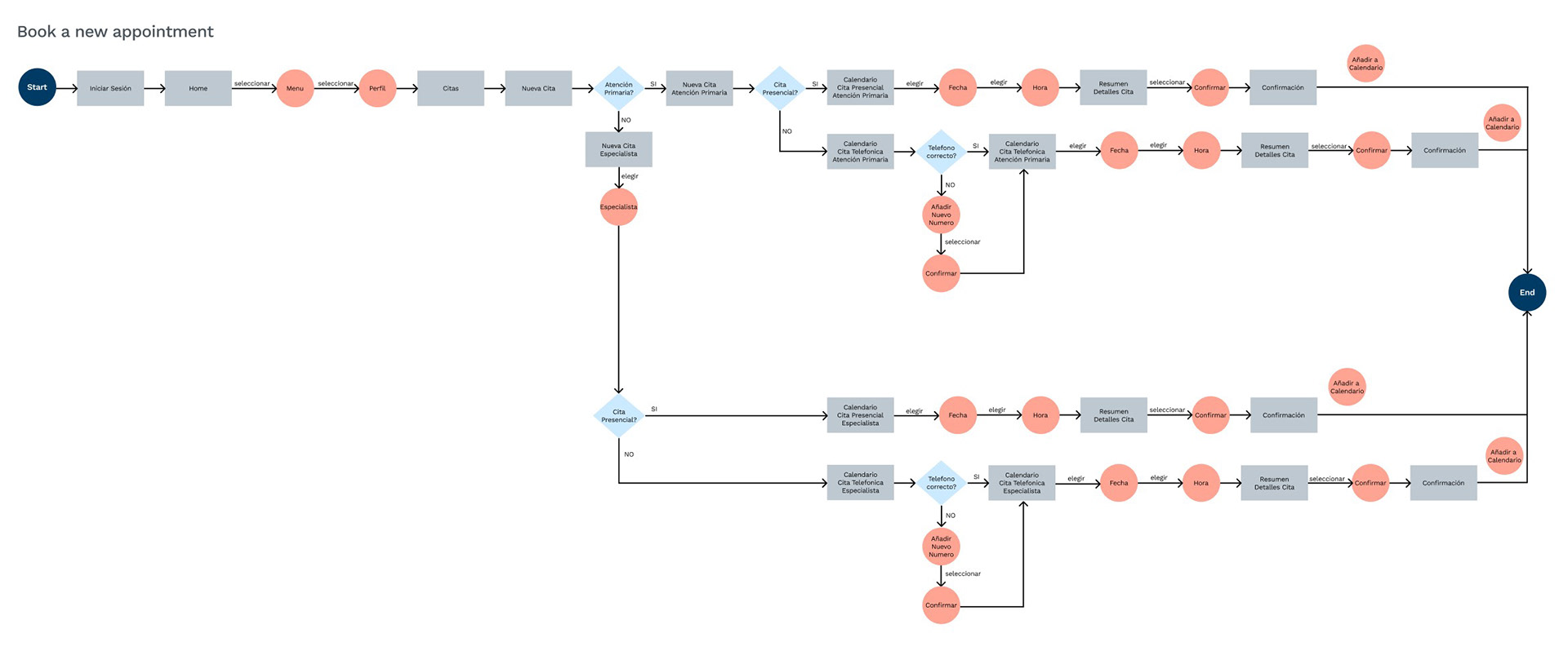
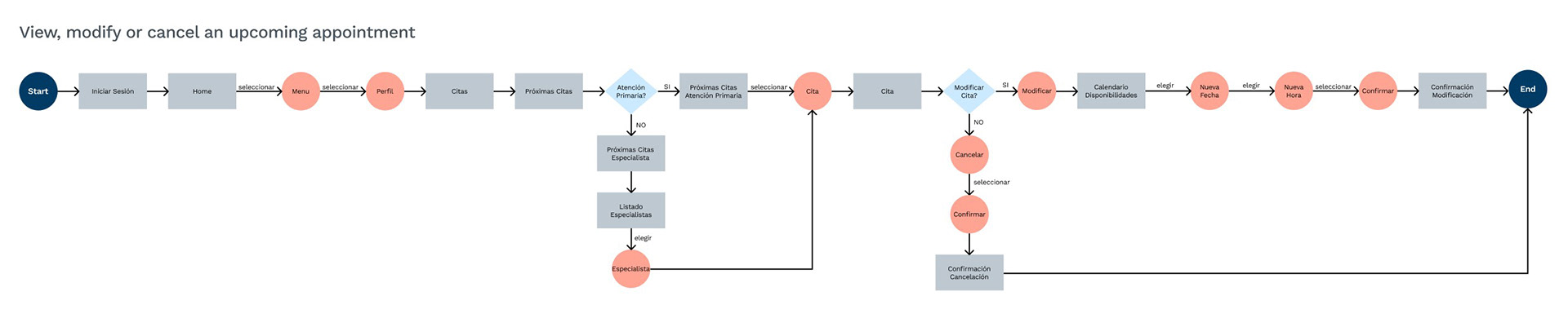
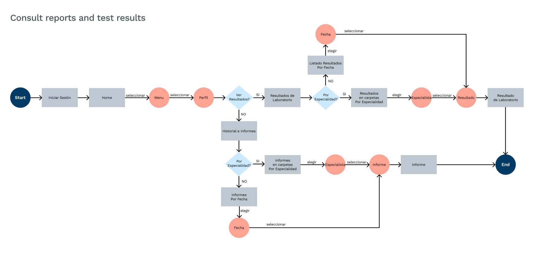
2. User Flows
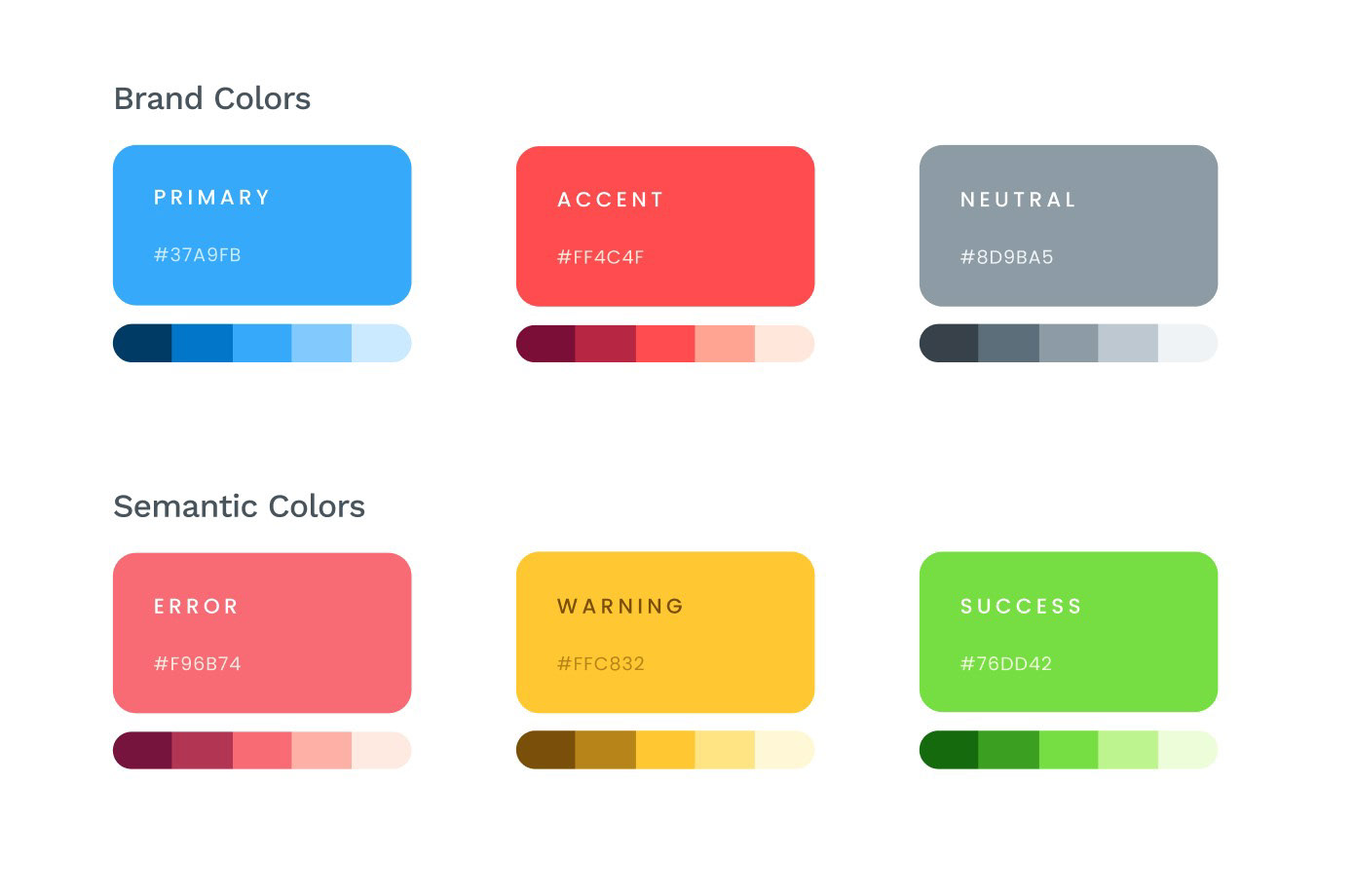
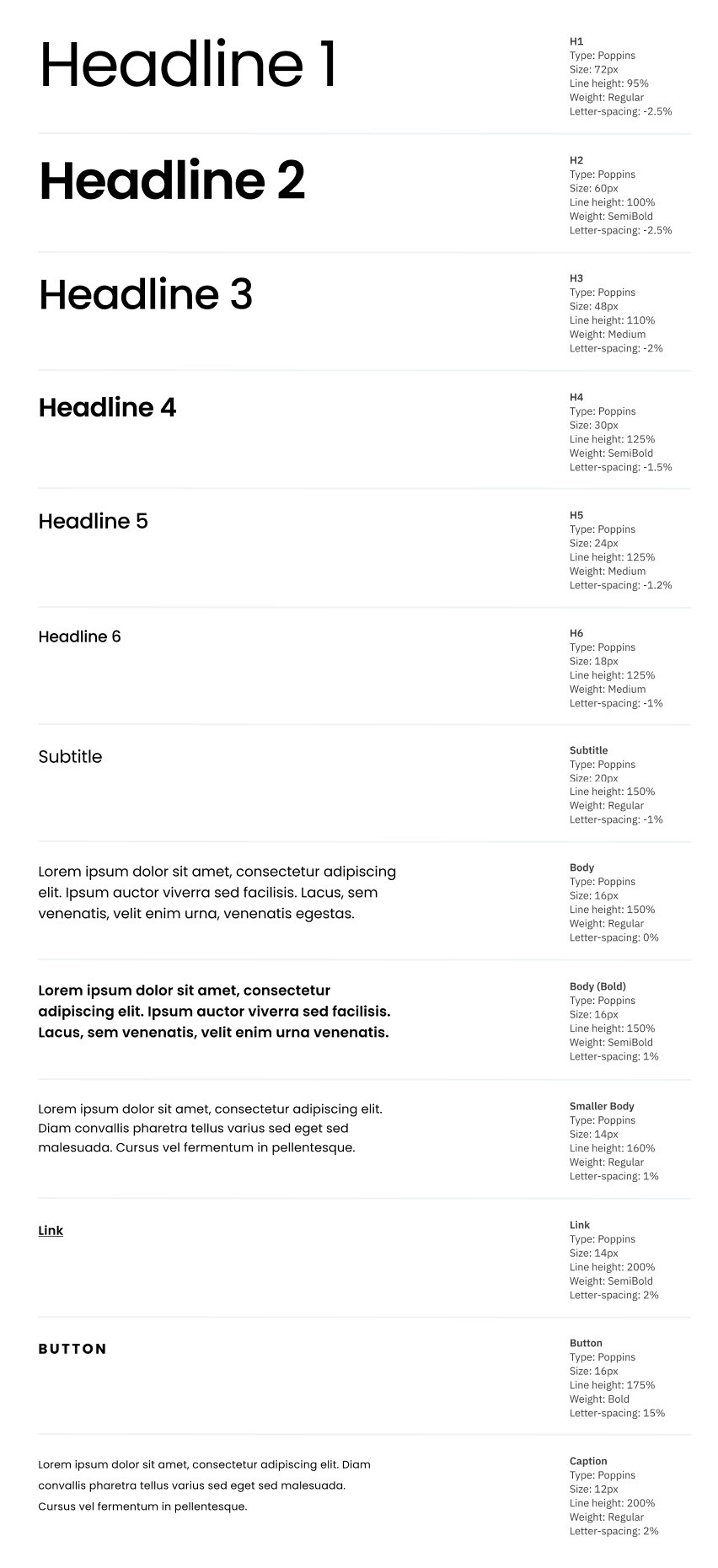
3. Design System
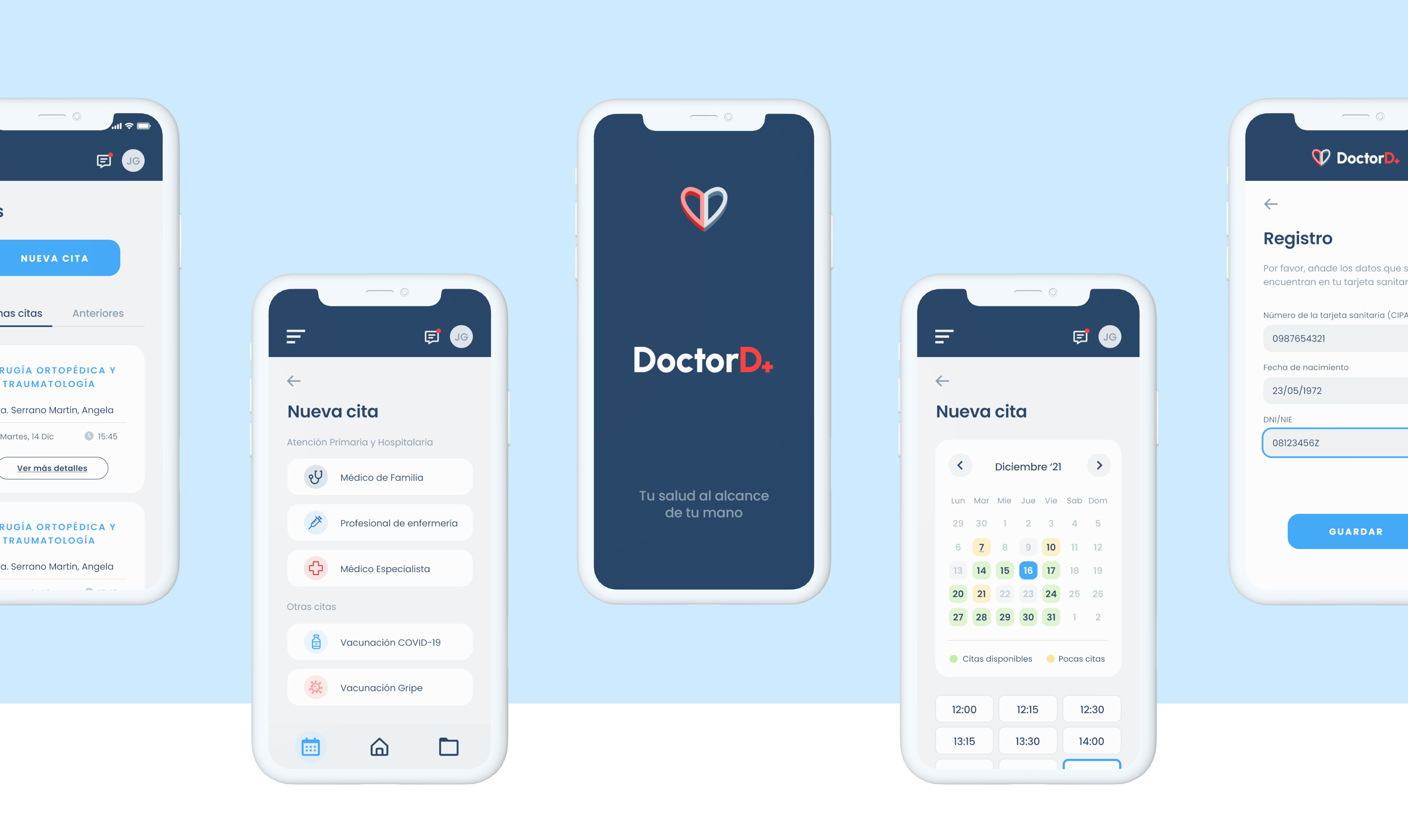
4. High-Fidelity Prototype
Once we had made the different flows in Mid-Fi and tested them, we decided to move them to Hi-Fi based on the branding we had previously developed. As it was an MVP we couldn't deal in-depth with all the aspects of the app, so we decided to focus our efforts on prototyping the following elements:
― Sign-up and first onboarding
― Booking and management of a doctor's appointment
Testing
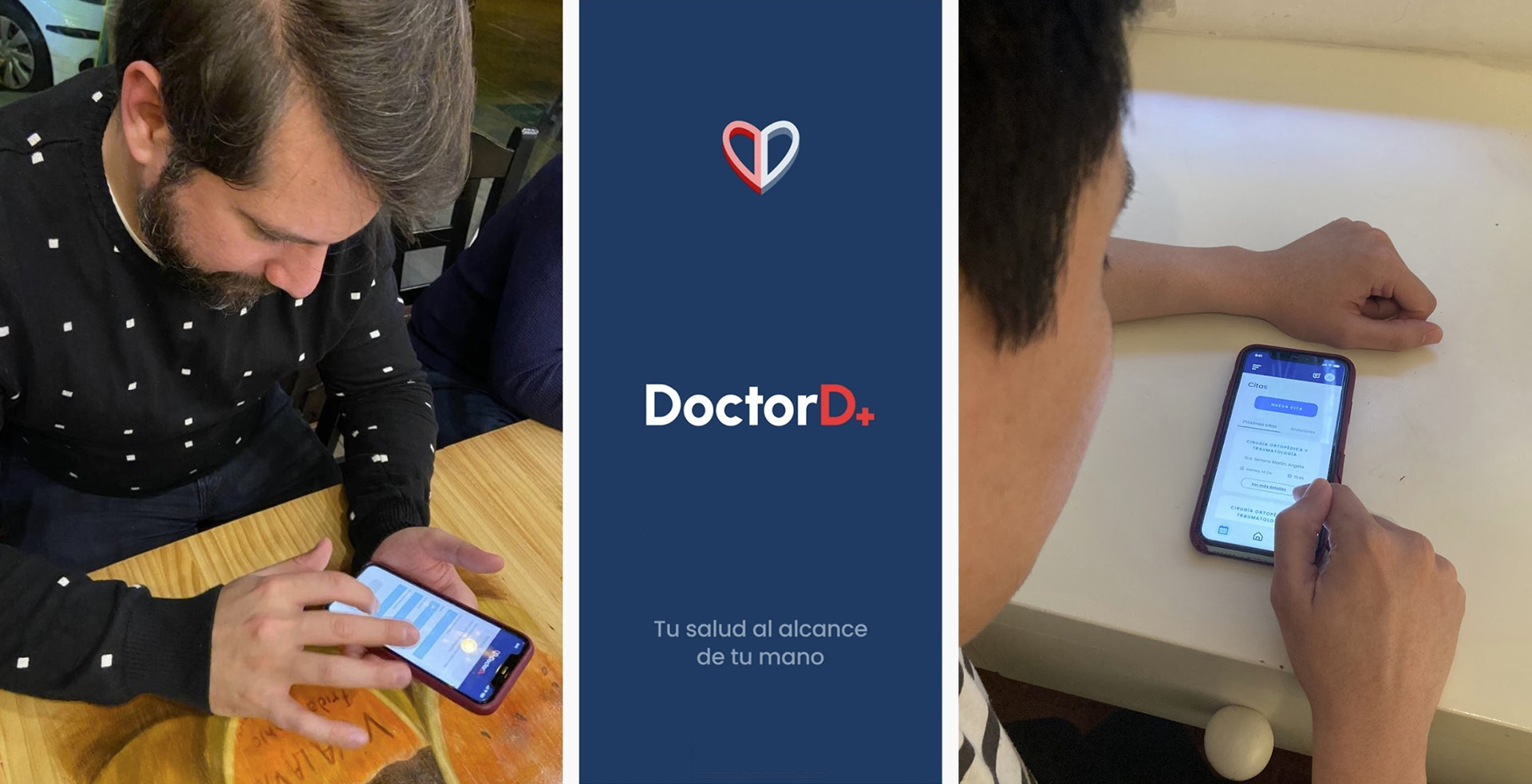
With the first version of the prototype completed, we set about checking the usability and comprehensibility of the screens through user testing. This phase was very fruitful and showed us some flows where they were lost, giving us clues on how to modify them to make them more understandable.
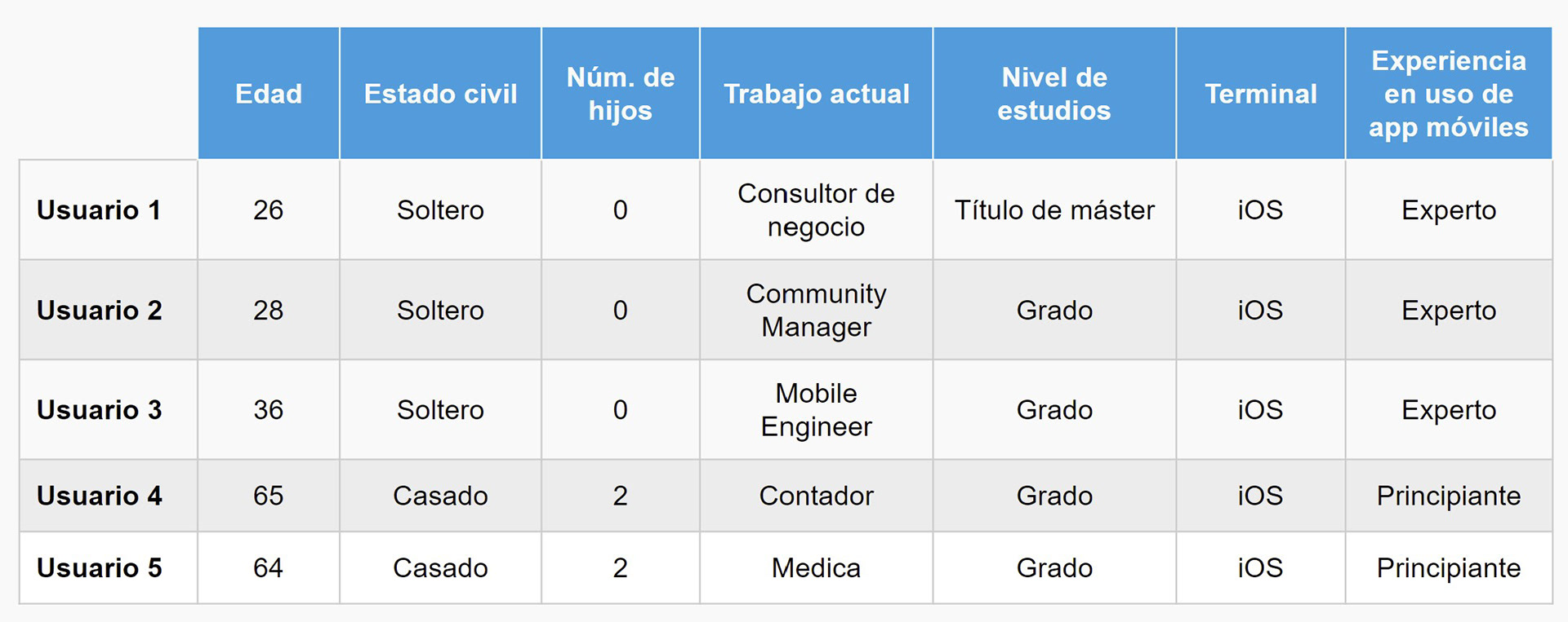
1. Our Users
We carried out a test with five users:
― three of them were young and tech-savvy people;
― two of them were so-called extreme users, aged between 35-65, and not very experienced in the use of digital platforms.
2. Two Tasks
Register with the app: “You have heard about this new app from the Community of Madrid for medical procedures with the public health system. You want to register, and you choose to create a profile for yourself and another for your daughter”.
Make an appointment: “You are Jesus. A few days ago, you started to feel a strange pain in your stomach, and you want to see a doctor as soon as possible. You choose to make a telephone appointment with the family doctor on the 16th December at 15:30”.
3. User Testing
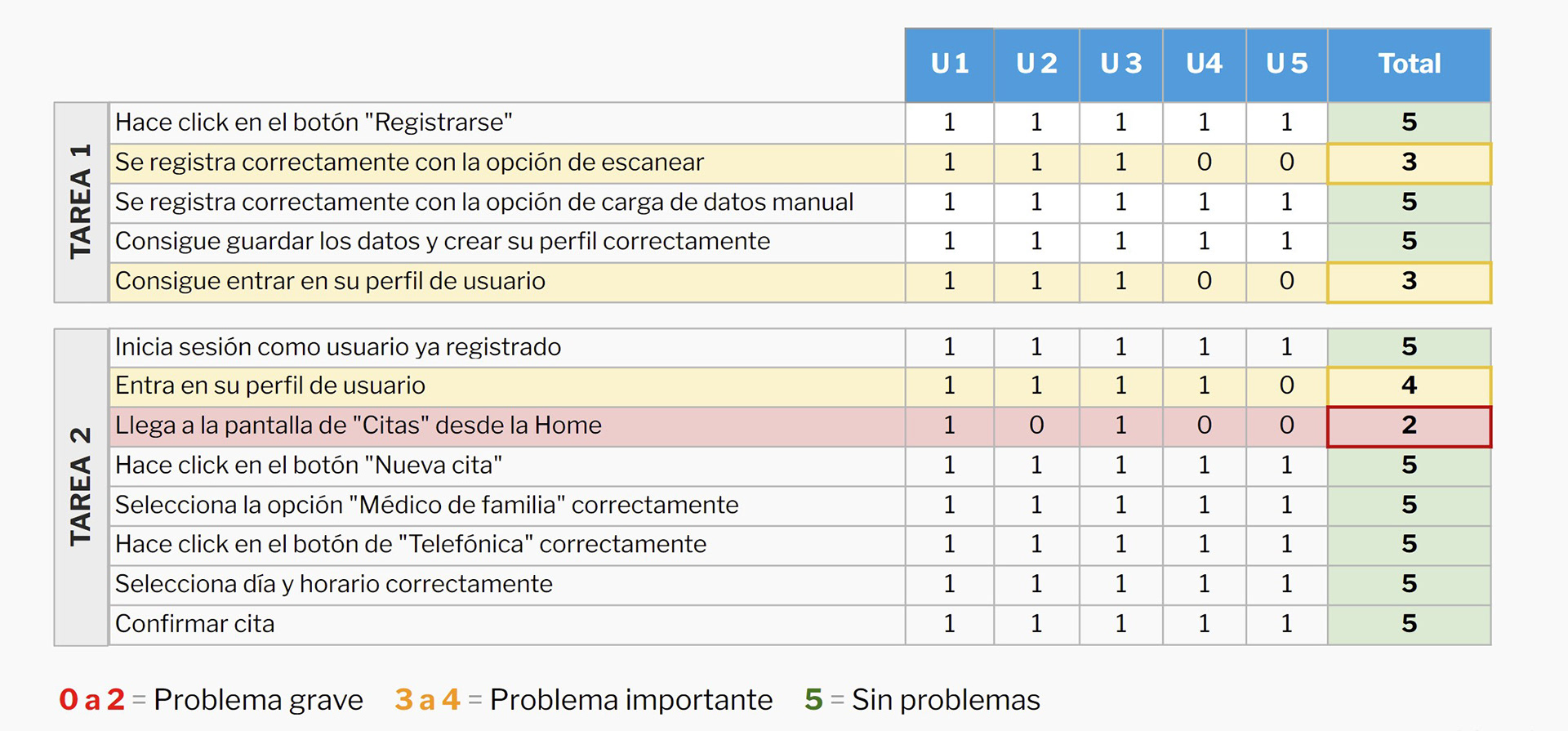
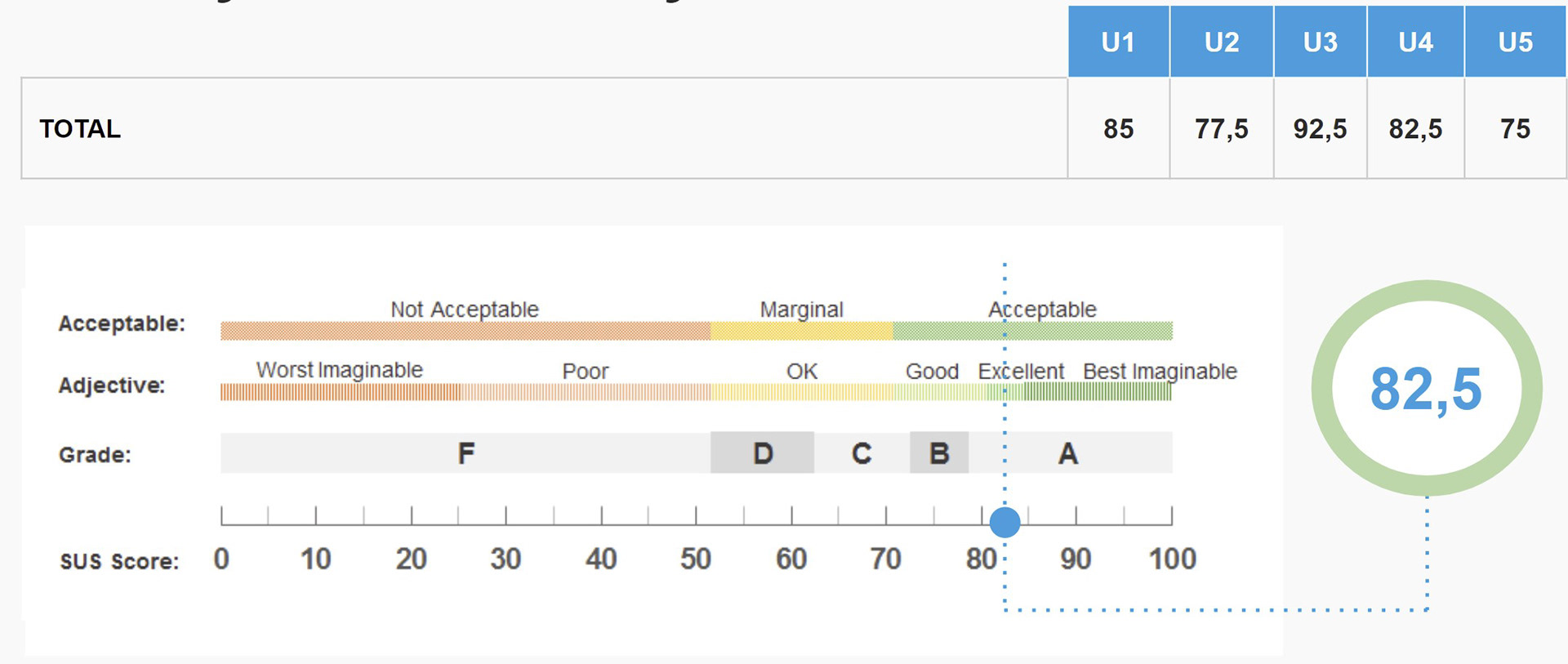
4. Task Conversion and System Usability Scale
These methodologies helped us identify the main pain points for the users while they were performing the tasks, and assign an overall usability score to the app.
Conclusions
The navigation of our app is confusing: users have difficulty navigating to the Appointments screen to request a new appointment, identifying how to access their profile, distinguishing the icons on the navigation bar, and finding the option to change the user profile.
We need to rethink the app structure: split the registration steps into more screens and include confirmation steps, change the order of the form fields in the signup steps, and visually clarify that the main user can manage the different profiles in the app.
Change the logout icon with one that is clear to all users.
takeaway
― It was clear from the beginning that we had considerable limitations in our project, due to the complexity of the Spanish public healthcare system;
― We learned to incorporate new Agile methodologies such as Lean Inception, which helped us to define our MVP in an efficient and concise way;
― Using the “Sequencer” as a methodology to effectively and quickly define the functionalities of the MVP allowed us to come up with relevant features that can add value for the public health user;
― Working alongside people from different backgrounds and experience levels has been enriching throughout the whole process;
― Never stop iterating!